let’s talk paper
 Probably the second most important thing to buying professional-grade paint is your choice of paper. Brush quality matters, but a person can figure out how to deal with wonky colors and a skanky brush. But there's nothing you can do about crummy, thin, wobbly paper. Avoid! To the left is my (current) stash of paper. Some good, some less-so.
The main things to think about when getting paper for watercolor is that it has to stand up to, well, water! To what extent depends on your painting. If you do real sketchy bits of color on your drawings or light washes for shadows, that's one thing; but if you end up drenching your pages with multiple washes, that's another. You'll want to think about relative weight/thickness of the paper, and also it's "toothiness." Hot press paper is smooth and can take more detail in pencil or pen; cold press has more bite and can stand up to more water and brushiness.
The black Moleskine sketchbook is the one purchased for everyone in ARC 381 for the 2019 trip. A lot of people swear by them, but it's new to me. Because I tend to paint on the soppier side, I will take butterfly clips to hold the pages taut as I work. Maybe you want to do the same. Also, some of the exercises that I recommend below would be good to do in the back of this book. I will want to preserve the front for travel, but the back will have color and glazing swatches, and also be a good way to get used to what that paper does.
For the rest of the tour--and I am mostly doing this since if you want to get into this, you'll probably want to supplement your supplies--the big green pad is a watercolor "block", which means that the glue that binds pads like that together is on all four edges, so the paper stays nice and tight as you paint (when it gets wet it expands/ripples; then it dries/contracts). It's by Arches, which is fancy stuff. Awesome for studio work; not necessarily necessary or helpful for travel. The Blick Watercolor pad with the spiral top was cheap, but is very smooth and not very sturdy. Not recommended. The little postcard pad is super quality paper, as you will find in the super-adorable little books by Stonehenge. I like having these little guys around for testing colors and also to have something to doodle on while I'm waiting for the big thing I"m doing to dry. Finally, the black spiral-topped notebook on top of the Moleskine is very nice stuff, and not too expensive, so a good pad to have for practice and fooling around.
color charts
 After following Elise's exercise with a few paints, expand to your whole kit to do a full color chart like the one to the left. A chart like this helps you study how the colors all interact with each other. You'll see the quality of each paint well, and also what happens when they blend with others Sometimes you'll get some interesting results you didn't anticipate. (Some reds and greens make warm grays that are prettier than anything you'd get out of a tube; likewise, I have found that violet + Payne's Gray is one of my favorite colors for all kinds of things.)
Try this!
Click the picture for a guide through this exercise. Make your own chart with pure and mixed paints. Don't forget to label them!
This exercise is all about the pure colors out the tubes and what happens when they're mixed. In other words, what kind of orange do you get when you mix your red and yellow? But watercolor allows you to do another kind of mixing that other media don't permit, and it's due to their transparency. When you layer different colors you are doing something called glazing, and it is very fun and cool
Try this!
Take another step in understanding colors by making a glazing chart like Danica (below) will show you.
When you've done both, compare: what do you think of the quality and depth of two colors when they are MIXED (as in the first exercise) or GLAZED (as in the second)?
(By the way, if you're working with thick/toothy paper, you'll have a better chance to see how some paints are very clear and consistent, and others have strong sediment that falls into the crevices of the paper. This can lead to neat effects if you plan for these layers and how the sediment will settle, but that's some next-level stuff.)
take care of your brushes
 Wet your brushes before you start to paint and rinse them thoroughly when you're done. Flick them hard to the ground to get rid of excess water then use a cloth or your fingers to squeeze out more and reform the tip before you let them dry thoroughly. Store them safely. Roll-up packs are nice since they keep everything cushioned and absorb moisture. Apparently you can also DIY something like that with a sushi mat. If your brush came with a plastic tube, you can replace it, just take care to not catch any bristles. In a pinch, your brushes can be wrapped in paper towels and tossed in a pencil case or a pocket of your daypack, but at least tape them together as you see in the picture to protect from mushing the bristles. When you're working, make sure to either have a brush in your hand or laying flat next to you. Nevereverevereverever leave them bristles-down in your rinse glass!
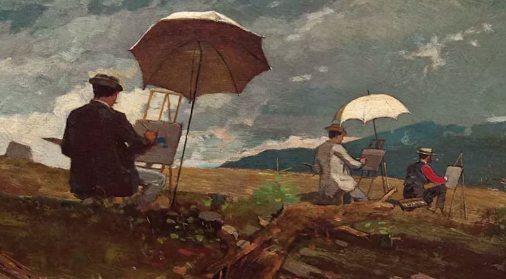
get inspired
As it's true in sketching, it's true in watercoloring: your job is not to recreate the precise scene in front of you; that's what you have a camera for. Your job is to record what is important to you, and render it in a way that you can communicate that importance to someone else. I find it really inspiring to look at other painters' work and think about why I admire the ones I really admire. I don't think it's just a pure aesthetic or taste thing, but rather appreciating the way people show a scene or building, which is a result of the way they see it.
Here are some watercolors by two people whose work I like a lot, Charles Sheeler (1883 –1965) and Sophia Kahn (@sophiakahnstudio):

Neat, right? Different, yes? Both require solid drawing to start, but differ so muchin the handling of the paint. Although Kahn's is more drippy and emotive, the Sheeler is not without its modulation in the washes.
There are, of course, a zillion images out there just waiting for your peepers to fall on them. Look around the internet (or maybe even in a real book ). The more you practice,the more you'll see interesting details hiding in the shadows and crevices--seek them for instruction and inspiration!
Finally, here is a short video from urban sketcher Danny Hawk, showing his favorite urban sketches/paintings from last year. It includes a great variety of subject matter and I like his approach to composition and using the two-page format of the sketchbook. Check it out!